01
Composition
Use one structural division, one slender accent, and generous uninterrupted fields. Alignment does most of the work, so personalization should share the same grid rather than float independently.
Make restraint feel unmistakably personal.
Quiet luxury replaces decorative volume with proportion, material contrast, and small details placed with intent. The goal is not an empty paddle—it is a paddle where every visible element has earned its place.
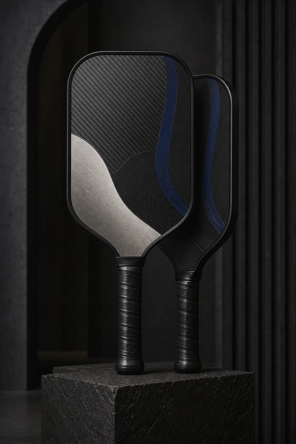
When to use it
A design-conscious player, a polished corporate or club gift, or anyone who prefers subtle initials and exact geometry over an illustrative statement.
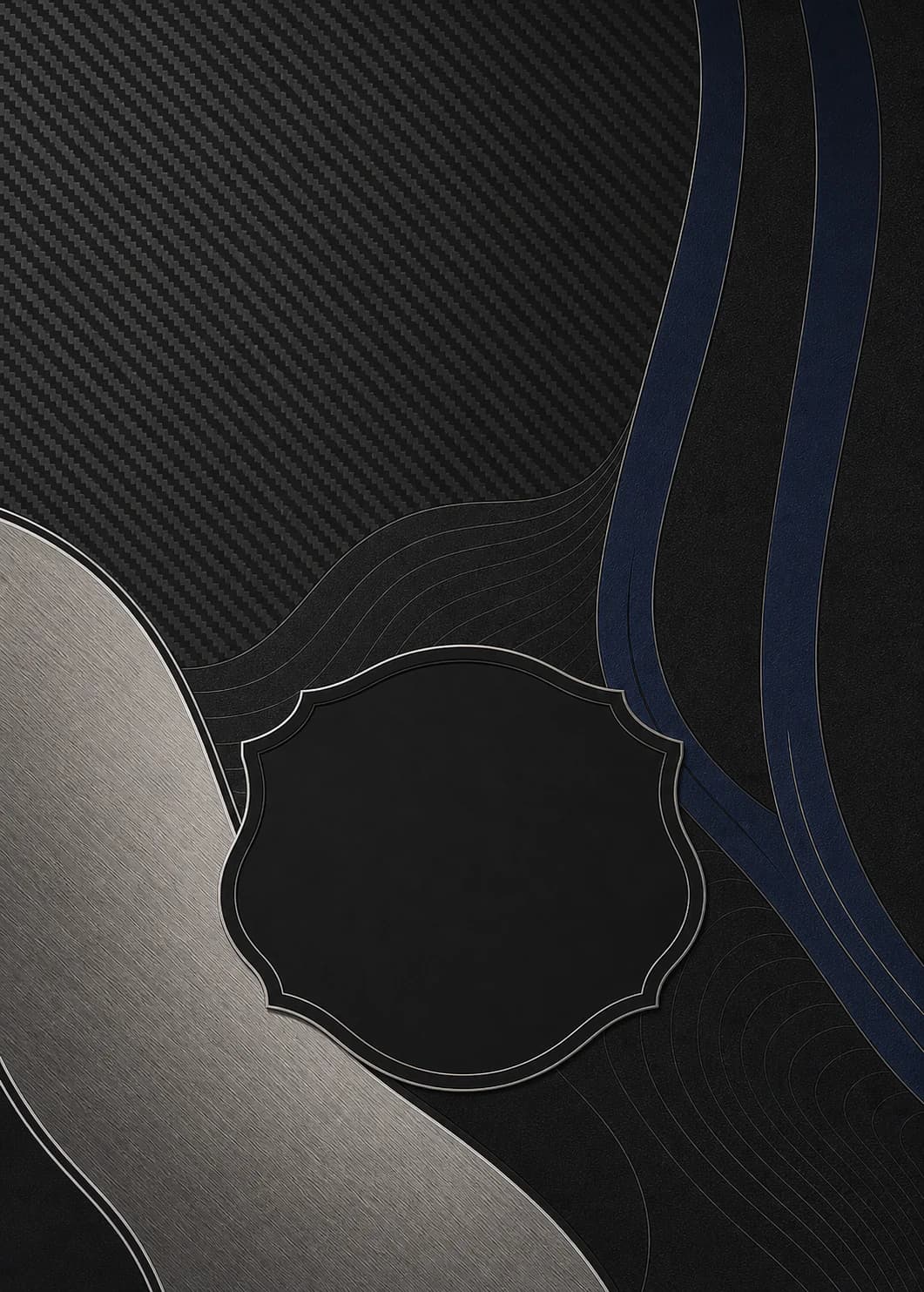
Use one structural division, one slender accent, and generous uninterrupted fields. Alignment does most of the work, so personalization should share the same grid rather than float independently.
Begin with obsidian or deep charcoal, add a platinum-like neutral, then use ultramarine or another saturated shade once. Contrast should come from light, scale, and placement rather than added ornament.
Keep names short and letterspacing deliberate. Initials, a surname, or a compact date line can feel more premium than oversized personalization when the surrounding geometry is already strong.
Three-part brief
Print-aware review
A concept can feel impressive on a bright, oversized screen and still lose its hierarchy at product scale. Use these checks before you treat a direction as ready for a physical proof.
These are concept-review guidelines, not a production guarantee. Final trim, color, surface, and material results must be evaluated on a physical sample before paid ordering opens.
Guided starting point
We will preload a trusted quiet luxury brief in the free preview studio. Edit the story, colors, and personal detail without starting from an empty box.
Preview only. No card required and no order sent to production.